React 组件库 CSS 样式方案
背景
最近考虑构建一个自己的组件库,需要考虑 CSS 样式方案
分析
当我们构建组件库时,考虑问题的角度和普通项目可能会不太一样,不但需要考虑开发体验,同时也要照顾到使用者的感受。
CSS 与 JS 的关联关系
CSS 的方案分为以下三种类型
1. 样式和逻辑分离。
组件的 CSS 和 JS 在代码层面分离,JS 里不引入样式文件,在组件库打包时分别生成独立的逻辑和样式文件。对于组件库的使用者来说,添加一个组件,需要分别引入组件代码和 CSS 文件。 假设做一个 Foo 的组件 index.tsx
import React, { type FC } from "react";

const Foo: FC<{ title: string }> = (props) => (
  <h4 className="foo">{props.title}</h4>
);

export default Foo;
index.less
.foo {
  color: red;
}
如果要使用这个组件的话 要同时引入 index.tsx 和 index.less
使用案例的话 element-plus
// main.ts
import { createApp } from "vue";
import ElementPlus from "element-plus";
import "element-plus/dist/index.css";import React, { useState } from "react";
import { render } from "react-dom";
import { ConfigProvider, DatePicker, message } from "antd";
// 由于 antd 组件的默认文案是英文,所以需要修改为中文
import zhCN from "antd/es/locale/zh_CN";
import moment from "moment";
import "moment/locale/zh-cn";
import "antd/dist/antd.css";
import "./index.css";此外 还可以借助打包工具进行按需样式自动引入,如
module.exports = {
  plugins: [
    ["import", { libraryName: "antd", style: true }], // `style: true` 会加载 less 文件
  ],
};
2. 样式和逻辑结合
将组件的 JS 和 CSS 打包在一起,最终只输出 JS 文件。使用时只需要引入组件就可以直接使用。
import 样式文件
import React, { type FC } from 'react';

+ import './style.less'

const Foo: FC<{ title: string }> = (props) => <h4 className='foo'>{props.title}</h4>;

export default Foo;
生成的产物是
import React from "react";
import "./style.less";
var Foo = function Foo(props) {
  return /*#__PURE__*/ React.createElement(
    "h4",
    {
      className: "foo",
    },
    props.title
  );
};
export default Foo;
.foo {
color: red;
}上面这种写法对我们使用组件的项目的打包工具是有要求的,通过打包工具将 CSS 打进 JS 里。例如使用 webpack 配合 style-loader 或 rollup 配合 rollup-plugin-styles。
举 rollup-plugin-styles 的例子
rollup.config.js
import styles from "rollup-plugin-styles";

export default {
  input: "src/main.js",
  output: {
    file: "dist/index.js",
    format: "cjs",
  },
  plugins: [
    styles({
      mode: "inject",
      modules: true,
    }),
  ],
};
main.js
import "./index.css";
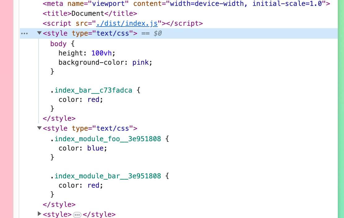
import style from "./index.module.css";
console.log(style);index.css
body {
  height: 100vh;
  background-color: pink;
}

@import url("./style.css");
index.module.css
.foo {
  color: blue;
}

@import url(./style.css);
style.css
.bar {
  color: red;
}
CSS in JS
在这个方案下,不存在 CSS 文件,一切都是 JS,对打包工具是没要求了,但是有运行时的性能消耗,而且作为组件库不好样式覆盖 「但也有解,见下一节」
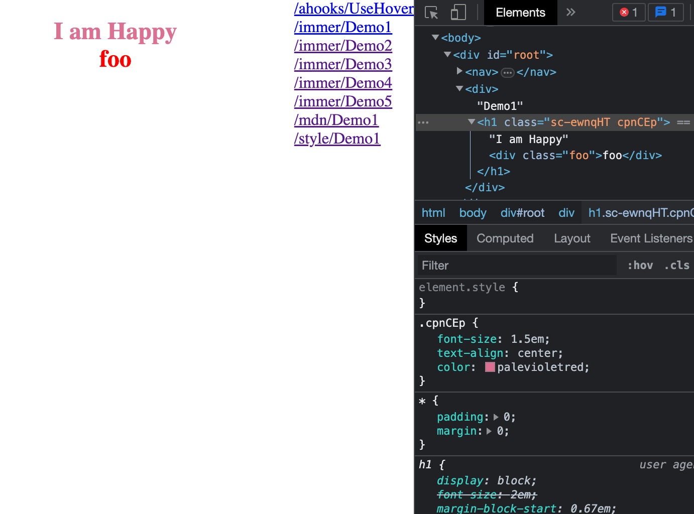
import styled from "styled-components";

const Title = styled.h1`
  font-size: 1.5em;
  text-align: center;
  color: palevioletred;

  .foo {
    color: red;

    &:hover {
      background: blue;
    }
  }
`;

function Demo1() {
  return (
    <div>
      Demo1
      <Title>
        I am Happy
        <div className="foo">foo</div>
      </Title>
    </div>
  );
}
再谈 CSS in JS
CSS in JS 最大的优势便是灵活,注意到 antd 5 和 mui 都选用了 CSS in JS 的方案
https://mui.com/material-ui/customization/how-to-customize/
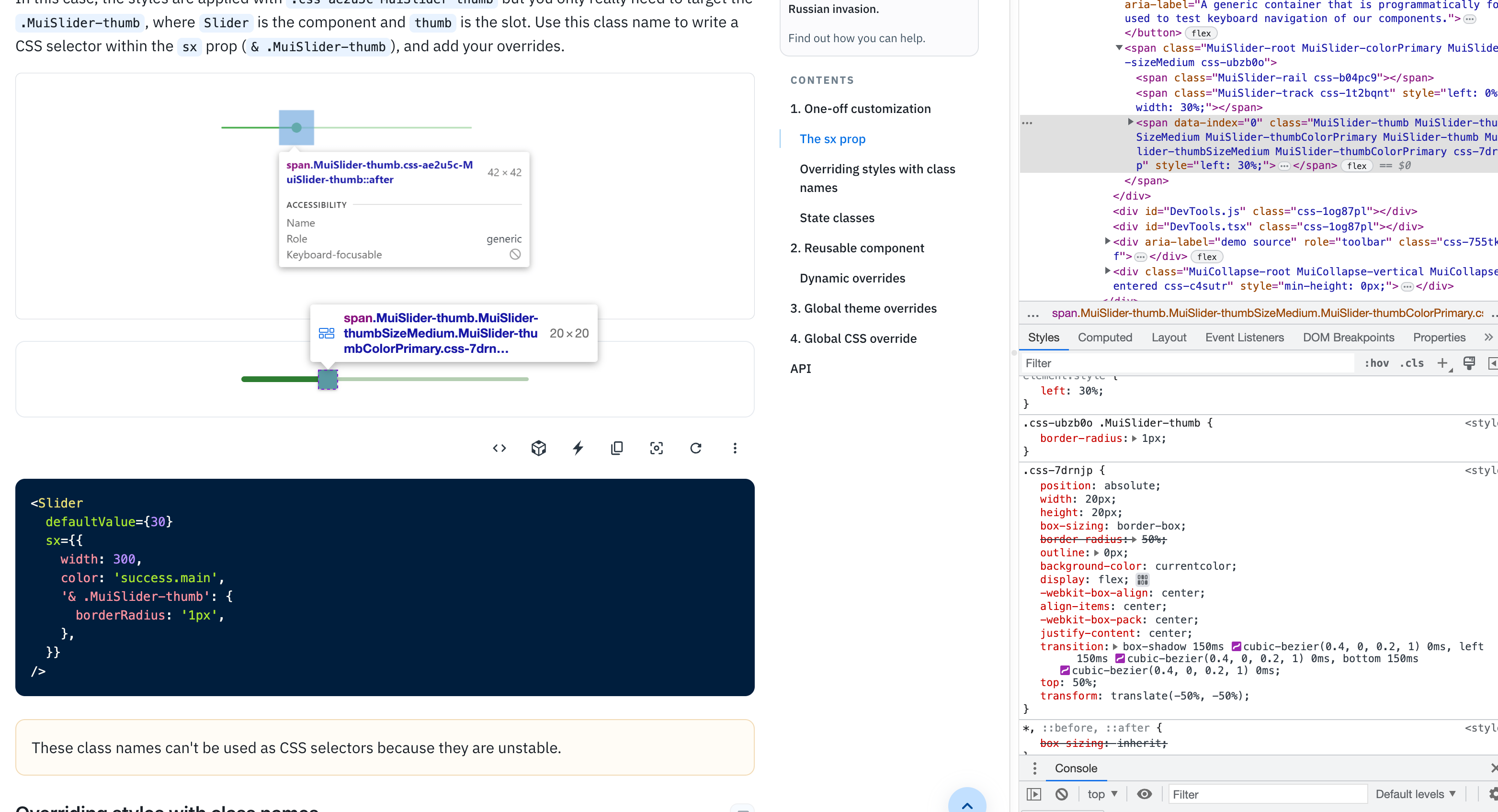
antd5 做的很棒,在样式方面借助 :where() 结合 cssinjs 的 hash 选择器,我们可以让组件的样式始终处于在 hash 的范围之下,这可以保证组件样式不会对全局样式造成任何污染,又方便覆盖 https://ant-design.github.io/antd-style/guide/components-usage
选择
最终选择用 antd-style 来做基于 antd 的二次开发,很舒服
下面是写的一个小 demo
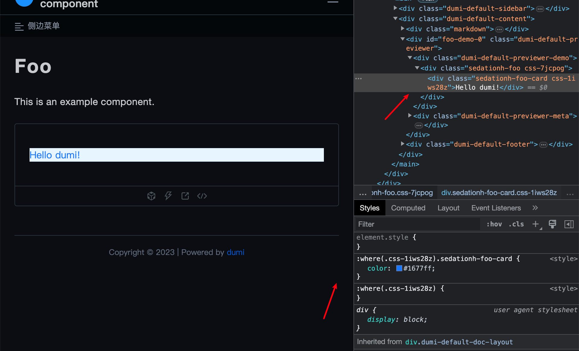
Foo/index.tsx
import React from "react";
import { createStyles } from "../utils";

const compCls = `foo`;

const useStyles = createStyles(({ token, css, prefixCls, cx }) => {
  const prefix = [prefixCls, compCls].join("-");

  return {
    container: cx(
      prefix,
      css`
        &.${prefix} {
          background-color: ${token.colorPrimaryBg};
        }
      `
    ),
    card: cx(
      `${prefix}-card`,
      css`
        &.${prefix}-card {
          color: ${token.colorPrimary};
        }
      `
    ),
  };
});

const Foo = (props: { title: string }) => {
  const { styles } = useStyles();
  return (
    <div className={styles.container}>
      <div className={styles.card}>{props.title}</div>
    </div>
  );
};

export default Foo;
utils.ts
import { createInstance } from "antd-style";

export const { createStyles, ThemeProvider } = createInstance({
  hashPriority: "low",
  prefixCls: "sedationh",
});
参考
https://juejin.cn/post/7097100515535765534 https://blog.pig1024.me/posts/62fa1f4e8631e51c9414da21